Contact

To reach the author, please contact jch (at) crunchychewymama (dot) com. For more information about Jessica Claire, visit her blog or website.

Saturday, July 7, 2012

Seeing the house take on the hues we've envisioned is a thrill! Painting is going slower than I had expected but should be done early next week. Then in goes the floor!

We have purchased several of our lighting fixtures but need to move fast for the rest. In keeping our feet grounded in the reality that we have a Cape and not a Craftsman home, our trim is all white, and our hardware (door hinges and knobs) will be brushed nickel. So that's the finish we've chosen for the three overhead lights we've purchased. The natural maple kitchen will have a medium green ("Green Mountain") Richlite counter. I am looking for some pretty art glass pendants for over the island, and we're unsure about the chandelier over the dining table.

The kitchen hardware (knobs and pulls) are not yet determined. If we go with metal (rather than recycled glass, which I'd love to get from Seattle-based woman-owned business Spectra if it weren't made-for-you expensive), it, too will be brushed nickel.

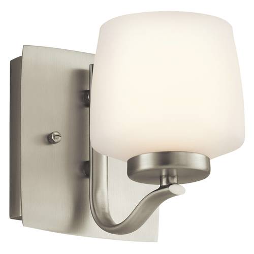
That means we can't pull off bronze in the sconces, which will be at either end of the back wall and also next to the piano and on the mini wall behind the kitchen. But bronze are the ones we like the best, the Kara from Quoizel. We're having a hard time picking something that is not too traditional, not too contemporary, not too detailed with stuff we don't like, and not too small for a tall room. Here are two of our top contenders for shape, if not for them being bronze and bordeaux finish


Quoizel Kara

Another Quoizel


Kichler
We'd love feedback!

Here are some interior images:

Front room - office

Front living room looking into kitchen and back dining area

Upstairs bathroom

Upstairs shower

Main level bathroom

Main level bathroom -- will have white wainscoting halfway up wall. Stained glass for interior window is still TBD

Front living room


New newel post - will be natural oak, as will stairs.

Kitchen with trial counter colors (ours will be green, not quite as dark as the olive but closer to that than to the others


Daughter's room
Son's room
Kids' rooms
Master bedroom

Thursday, June 28, 2012

Interior transom window: time for creativity!

This whole process of designing and finishing a remodel is one big exercise in creativity: how do you make something functional for years to come -- with a growing family -- and beautiful for the everyday, with a growing family?

The problem is, when you have so many decisions to make about things like interior doors and flooring, it's hard to luxuriate over non-necessities. Add to that the multitasking caring for two small children and preparing all one's food from scratch for health issues, and you have three full-time jobs. Some tasks just don't get their due, as interesting as they might be.

Take, for example, the transom window concept Anila of ALine Archicture came up with to allow natural light into our small main level full bath since it lost its window with the construction of the addition. We have the same problem at our current house, and I do tend to leave the light on in there a whole lot because otherwise it's so dark you don't even want to go in to wash your hands!
So, to let natural light into the bathroom, Anila proposed a 36"x14" transom window at the top of the shower into the big family room that has vaulted ceilings and two solar tubes.
On the family room side of the wall, the window would about a foot and a half above where we plan to put the piano. This was a fabulous idea, and I'm so glad we did it!

 
Anila suggested that we could create a custom art window that would float above the piano, about 12"x36". Between the piano and the window we could do some kind of mirror image of the window art in another medium, perhaps with hinges in between the two so it looks like a full built-in concept, a diptych.
Anila offered to come up with original artwork, but I wanted to give it a try myself, at least to get started. I've been musing on the design of this in my head for weeks, maybe months, craving the time to work on it. Since I love to play with design but don't have a ton of drawing prowess, I painted several sheets of paper with the colors I want and then cut them up into small pieces to make a collage.

It was beyond challenging to find uninterrupted time to arrange the squares. My soul really wanted to drop down into the activity for full creative expression, not just play at it like puzzle pieces on the way to switch out the laundry or between contractor phone calls. When I did try to do it while the kids were playing, my daughter just kept tipping over the baskets of collage "confetti" and mixing them up. I love abstract, but that's not the look I'm going for here!

I want the piece to feel organic and beautiful, but with a slight edge. Ideally this would be stained glass, which I adore. However, cost might push us toward an image printed on acrylic film. (And I also need to look into the issue of lead in solder and glass with stained glass).
 
The bathroom will have white wainscoting on the bottom half and be painted with Sherwin Williams' Liveable Green, a light sage green, on the top half (color-matched in AFM Safecoat at Amicus Green Building Center). The bathroom floor tile is dark green, and the tub surround is white subway tile. We have yet to find a vanity but are looking for a vintage wooden cabinet onto which we could put a sink. Let us know if you have something 18-22" square! Something like one of these from ModernBathroom.com.

On the piano side in the family room, the walls are Sherwin Williams Antique White (made in AFM Safecoat at Amicus). This is the color for the whole front entry (both rooms), kitchen and back addition. All the trim in the house is white.

I envision the primary colors of the window art to be purple and green, with some browns and peaches. The artwork should be something that will work well flipped upside down. So maybe it should be a trailing vine of some kind that goes up diagonally to the right on the window and down on the piece below, making a V that opens to the middle of the room. Or maybe it should be something with three blossoms, as I've tried to capture below. But it should be something botanically accurate, not silly little pom-poms of purple!
The walls were primed today, and painting and other finishes will be going on next week. We expect to move mid-July and are at the point where my contractor is hounding me to confirm the materials for this window, so I'm hoping to find a local glass artist to create it at a reasonable cost. And in the near future!


Sunday, June 24, 2012

Kitchen coming together

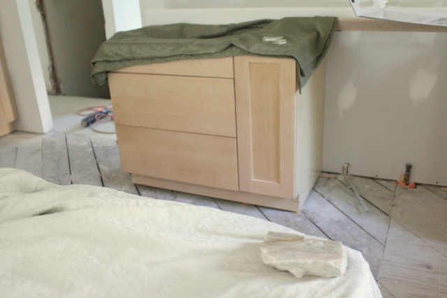
Words cannot express how exciting it is to have the kitchen cabinets in place. There are a few issues we need to address, but it's beyond helpful to see the natural maple cabinets in their new natural environment.

We still don't have the natural oak floors down, so it's not exactly clear how the woods will go together. We just hope they don't compete too much!

I know that the maple will age and deepen some as time goes on, but we are now leaning toward a somewhat darker counter color than we had expected, especially once we brought over the tablecloths and sheets to try on the runway.

The photos don't capture perfectly, but everyone agreed that darker olive green did clearly look better than the two pale greens. Anila of ALine Architecture was on hand to discuss colors (and to advise on materials for the porch, which will have to be another post another day).


This led us to pull out the Cambria again: Collybrooke on the left, Ferndale on the right below.

 Collybrooke has a nice tone-on-tone swirl pattern, but it fades pretty quickly as you stand back. And it's still a little too dark and brownish grey, but close. Ferndale has lots of speckles, which we were trying to avoid, but the colors are nice and go well with the fully-leafed-out woods in view in the back.

Here is the Ferndale against our current Mint Green granite.
A little more taupe and browner chunks of glass rather that white swirls, but pretty close, right?


Here is the chunk of Monte Bello granite in the foreground on the light green "counter" and the Trikeenan Tweed Boneyard Brick and light green Motawi (which we can't afford but love) on the olive "counter" in the back.

Here are those tiles up close considering as backsplash:

Now I'd like to go back to check out bigger chunks of Cambria and also reconsider Chroma Sage and Caesarstone Rosemary (both pictured here, I think, with our bathroom floor tile and the Motawi and Caesarstone Buttermilk:) 
 
 We thought the Sage and Rosemary looked kind of drab before, but it might be worth getting samples to bring into the space now that it's laid out.

John has also just found Zodiaq, another engineered stone by DuPont that's sold at Lowe's. He likes Magellan Green, but I think it seems a little dark and am more partial to the Wintergreen, which has 25% post-consumer recycled glass. May need to check out in person, but that would require a trip down Route 1 on a hot day.

Tomorrow we are headed up to Amicus Green Building Center to check out their concrete options and Richlite (and to get our paint). On Friday we stopped by Artisan Concrete Concepts, pictured below. We could make up a custom color if we didn't want any of the standard ones he already has. The green is probably too lime, and there's no guarantee how much variation or swirl you could get.The more decorative marble-looking items on the wall and on the small table are not something that they typically do in large scale for kitchen counters. They come with a price tag, but they are really cool!


Wednesday, June 20, 2012

Counter conundrum continued

Contrary to my most recent post, where I proclaimed that my love of the beauty of granite would trump my efforts to do things in a sustainable way, I'm thinking of pulling out of the granite ring.

After a friend casually asked, "Isn't granite unhealthy?" I started my research anew. The more I read, the ickier it sounded, from transporting stones from Brazil or Africa to China and then to the U.S., to some stones having crazy high levels of radiation and other heavy metals. There's the 2008 New York Times article, a WebMD entry, a Snopes piece, and morning shows about the issue.

And then I asked my doctor, an integrative MD who uses Applied Kinesiology. She said the color I was considering would be "highly detrimental" to me. I didn't have time -- or was I prepared -- to ask her about other materials, but since then, I've been reconsidering granite.

If all things were equal and money were no object, I would probably go for custom concrete counters, which I wrote about early on in this process at this post back in January. I like the idea of creating something unique. It can be beautiful. After talking with landscape designer Nancy Striniste of EarlySpace about possibly using dyed concrete with flower and plant pressings for our porch floor, walkway, and/or driveway (in two tire strips with grass between), I started to warm back up to the idea of concrete kitchen counters. I sure would love a built-in dish drain!

Now, in addition to concrete, we are also considering other materials for our kitchen counter. Right now, engineered quartz like Silestone, Cambria, and Chroma are not on the list because I just don't love any of the colors or finishes, and they contain enough natural stone that there might be a concern there, too. And they are not a whole lot greener than virgin stone, I don't think. They are somewhat cheaper, like $5000 instead of $7500 for granite (one fabricator's estimate. Other granite estimates came in as low as $4000 and as high as $10,000, depending on the stone and the fabricator).

One non-stone option is paper-based Richlite (color: Green Mountain).  I'm not in love with the PaperStone look, though, and the way it wears. But I could be convinced, especially if the price is right.

As for recycled glass, it's pretty, but also pretty contemporary. We've got natural maple shaker cabinets and an oak floor, so multi-colored glass chards just don't provide the look we're going for. Don't get me wrong; eclectic is cool. We may have abstract art alongside repurposed barn timbers in a few places in the house. But for a counter, I like calmer. Less multi-chrome confetti explosion. Also, the recycled glass comes with a hefty pricetag. But I could get used to the idea if the right color came along.

I'm hoping to get a price on DEXterra terrazzo (color: Green Goddess) and some more info on how the product wears.
Ice Stone is too expensive, especially since it is pretty high maintenance and can stain.
We're getting lower maintenance Eco by Cosentino (color: White Diamond) for the upstairs bath vanity, but we don't like any of the colors for the kitchen.
I don't think any of the colors of Squak Mountain would work for us unless we went with a really lively backsplash color (which might send me back to Fireclay tile).
One vendor suggested Avonite, but I'm not in love with the Morning Tundra color that is probably closest to what we'd want and shows that it has recycled content. Maybe if I saw it and some other colors in person...

Where we are now is waiting for some price estimates, and then we'll need to go look at materials in person and through portfolios, especially of concrete.

I'm also casting about for a Geiger counter that I could take with me to a slab warehouse and see what it says about different types of stone.

It's been hard to buckle down and make a decision while we've been dealing with construction delays due to mold remediation (which is a whole other story I've yet to write). But we seem to finally be back on track, now halfway through drywall installation. We should really be templating the counters next week. So we hope to have some apples to compare soon!

Wednesday, June 13, 2012

More on counters

We can't seem to make up our minds. The sticker on the Monte Bello was high, so we continued our search and found it elsewhere with another fabricator at a much lower cost. It's still lovely but it's less green and more grey. And we still don't know what backsplash tile we'd use with it!

This new choice, Del Mare, is a green that looks really nice with the offwhite ("Drift") Boneyard Brick tile we like. So it is our current top contender. Concerns are that it might be a little dark or a little blue, but we love the veins, and it has yellow streaks that go well with the maple cabinets, too.

I am still going to look some into the whole granite/radon question and will post some links when I've read through more and my internet isn't being temperamental.

Assuming I get comfortable with the stone (since I can't seem to really like any more eco-friendly material for the kitchen, and even if I did, they cost a whole lot!), then I'd love feedback on this green! And the contrasting Monte Bello.
Three views of Del Mare granite (or really quartzite?)

With "Drift" possible backsplash tile


And the greyer, sublter, more neutral (but maybe ultimately too grey and too much like marble?) 
Monte Bello:


Here's a reminder of what a board of that Boneyard Brick tile looked like with another green sample that would be similar to the Del Mare:

Wednesday, May 9, 2012

Counter color

So it turns out that white cabinets give you more flexibility on counter color than with natural maple. At least it seems that way. Here is our current kitchen with Mint Green granite.

And here is a drawing of what the new kitchen will look like:

The more I look at things, the more I want a green stone again, even if it's not the most environmentally-friendly choice. Some say that quartz is better because it uses stone that is already mined; others say a mined product is a mined product.

In any case, I want something that makes my heart hum with beauty when I chop vegetables on it. I am making a lot of choices based on what is "Green" and what is healthiest, least toxic for my body. Here, I'm looking for the Ahhh factor. I want to infuse the everyday with something that visually reminds me of peace and higher purpose.

I love the Mint Green, but I think this time I want less speckle and more movement, more flow. And I want something that will give me the chance for at least some fun in a backsplash without feeling too competitive. Notice that you'll see the backsplash a lot from the stools at the island as well as from the dining table and family room behind that, in the addition looking into the kitchen.

It's stuck in my mind for months that my friend Paula said before we redid our current kitchen, "You want something that reflects light," not a repeat of the black counters that we inherited with this house, which I didn't mind. A lot of people do black with maple, but that's not the look we're going for. The house will have lots of green accents (and some purple here and there, like bathroom towels. No, they are not organic, but they are the color I want!)

So we're going light again with the counters, and I am leaning toward a green quartzite called Monte Bello or Mother of Pearl. Here it is next to a maple shelf and two green tiles just for a point of reference. One tile is the dark green we've chosen for the main level bathroom floor. The other is a Motawi crackle I just love but is something upwards of $40 per square foot. So instead of ordering it, I just carry it around with me to remind me what makes me swoon.


 After I showed interest in the Monte Bello, the sales rep at R. Bratti emailed the next day to say she'd gotten in a new quartzite called Sea Pearl, but I found it a little too blue/grey/cool.
 If we wanted to go quite light, Taj Mahal here is another option with small swirls of greenish brown:

Over at Architectural Ceramics the other day, we hadn't yet looked at these slabs and were trying to see what kind of tile would look good in the way of backsplash with a cream counter
 We became fond of the Trikeenan Boneyard Brick, which is a pretty cool recycled project. I love the texture, and the Tweed is a fun color.

I like it better than the Trikeenan Modulus in Bamboo pictured below.


We also wanted to see what might work with a green counter. The Costa Esmeralda is too blue, but it helped a little. Here are the white and offwhite Boneyard Brick stock colors (have to look up their names)


Here is a warmer Verde Laguna approximating the counter

Next step is to get a vote from the guy who is paying for all of this, and if he can conjure up a crush on the Monte Bello like the one I have, then we need to get him there in person and get a quote from the rep. Then, if those exercises go well, we can get a sample and take it back for some tile matching.

If this was the only thing I had to decide on this week, it would be a lot of fun.